
Designing for Efficiency:
Helping Nurses Review Documents Faster
Project Overview
My Role
UX Researcher and Designer
My Team
1 Product Owner, 1 Architect, 3 Developers, 2 Q/A
Tools
Figma, Miro, Dovetail, Maze, Jira
Skills
User Research, Prototyping, Usability Testing
Business Impact
50% Increase in Process Efficiency, Quick Feature Adoption
PureOHS is an occupational health platform used by major organizations to manage employee health records, exams, and case documentation. As part of a broader modernization initiative, our team identified a critical gap: there was no dedicated workflow to submit and review incoming medical documents - a process that was previously manual and inconsistent.
Problem
Clinical staff lacked an efficient way to manage and review employee-submitted documents within PureOHS, relying instead on manual processes or external tools.
Goal
Design an integrated clinical document review workflow within PureOHS that enables clinical staff to manage and process employee-submitted documents directly in the system.
Discovery and Research
User Interviews
Goal:
Understand the current process and identify challenges in managing documents.
Participants:
Interviewed 4 Clinical staff and 2 System administrators across 4 clinics.
Method:
Conducted 1:1 interviews via Teams, Analyzed interviews using Dovetail

The Dovetail Tag Board provides a visual overview of all research tags, helping teams spot patterns, explore insights, and access related data quickly
Tag - Research label to interview notes
Tag group I created based on identified pattern: Feedback, Receiving Documents, Reviewing Documents, Needs, User
Dovetail Tag Board
Understanding Current Process (Task Analysis)
The clinic’s document review process was inefficient and burdensome. Staff had to track submissions via email, and engage in lengthy back-and-forth communications to correct errors. Additionally, files often require editing to meet upload requirements.

Identifying Painpoints
Sort crowded inboxes
Employee document submissions were tracked through email, requiring staff to manually sort crowded inboxes.
Back & forth email on rejection and status tracking.
Incorrect documents required staff to email employees with explanations and resubmission steps
Time spent to download, edit, upload document into PureOHS
Clinic staff downloaded the files and uploaded it into PureOHS. Some files needed resizing/ formatting to meet system limits.
Multiple forms to fill
Staff entered data into multiple forms for each medical record, a repetitive, time-consuming process.
Personas
Goal:
Formulate user goals, pain points and needs identified through user interviews.


Employee
Clinical Staff
"I just want an easy way to send in my vaccination proof and know that everything's good - I don't want to guess if I'm cleared to work or not".
"I need a system that helps me streamline employee document review process and allows me to quickly review and enter information to their medical chart.”
Personas helped us identify challenges faced by users and to brainstorm workflows that could improve their experience, guiding the design of the feature that aligns with their expectations.
Challenge
How might we enable clinical staff to efficiently review employee-submitted documents within PureOHS ?
Ideation
Mapping Solutions to Painpoints
Our team collaborated to brainstorm and evaluate potential solutions to address the pain points in the current process.
Sort Crowded Inboxes.
Time spent to download, edit, upload document into PureOHS.
Submit documents via PureOHS employee portal
If employees submit documents through employee portal, the clinical staff will receive the documents directly within the system cutting down the time spent to download, edit and upload to 0.
Back & forth email on rejection and status tracking.
Configure reasons to send on rejection
Clinic staff can configure common reasons of rejection. When they reject a document, they can just select the reason to send with the status.
Clear status to track progress
Employee can view the status of the document by logging into their Employee Portal.
Multiple Forms to fill.
Let employees fill in the required data
Employees can fill in required data with submitting the document, reducing staff's administrative work.
Proposed Feature Flow
Goal:
Combine potential solutions into a structured, end-to-end workflow addressing the needs of both employees and clinical staff.
Potential Solution

Feature Flow

Journey Map
Goal:
Identify moments of confusion and opportunities in the proposed new process
Employee User Journey Map
For employee, it visualizes the document submission process - from login to feedback.

Employee
Clinical Staff User Journey Map
For clinic staff, it captures how documents are reviewed and managed.

Clinical Staff
Design Approach
Enable quick, confident actions
Provide clear statuses, filters, and one-click options so documents can be triaged and managed without hesitation.
Present information with clarity
Use a clean, structured layout that highlights key details while avoiding clutter, ensuring providers aren’t overwhelmed.
Support compliance and flexibility
Maintain an audit trail of all actions while allowing organizations to customize workflows to fit their clinical needs.
Design and Prototyping
Prototyping
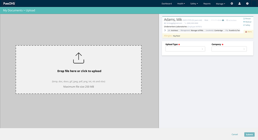
- Employee Document Submission
-
Central drag-and-drop upload area to draw attention to the primary task.
-
File types and size limit clearly listed to reduce user error.
-
User context for verification
-
Required fields marked for clarity and form validation.
-
Dropdowns used for controlled input.
-
Side-by-side layout to view the uploaded vaccination card while manually entering data, minimizing cognitive load and reducing errors.

-
Dynamic instruction appears after selecting the upload type to guide users step-by-step.
-
Delete icon for each entry to give users control to correct mistakes.
-
"Submit" and "Cancel" buttons anchored at the bottom for clear and consistent call-to-action and escape path.
-
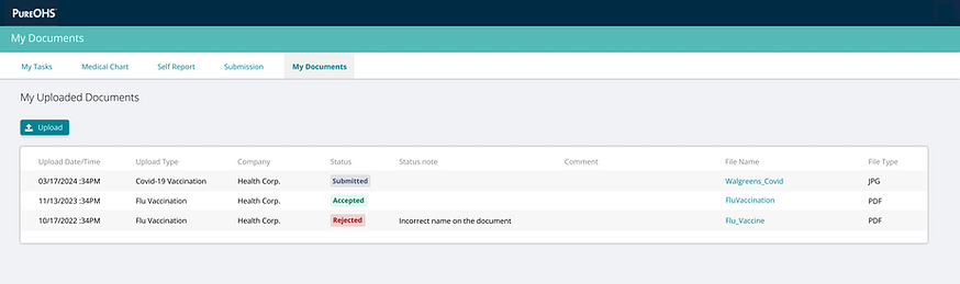
Upload button placed at top-left for easy visibility and frequent action access.
-
Table format provides a clean, scannable view of all uploaded documents with key metadata.
-
Color-coded status tags offer instant feedback and status recognition.
Prototyping
- Clinical Staff Document Review
-
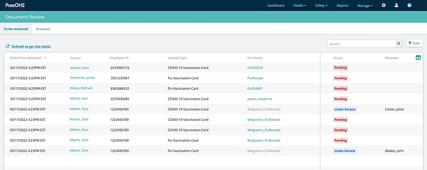
Clear Categorization ("To be reviewed" and "Reviewed") to separate pending and processed documents, improving navigation.

After Review
-
Search and filter to improve data organization
-
Color-coded Status indicators provide quick visual cues, enhancing decision-making speed.
-
Side-by-side layout for efficient review.

-
Option to rename document for improved identification.
-
Prominent "Accept" and "Reject" buttons with distinct colors facilitate quick decision-making.

-
Mandatory rejection reason and free text field for clear communication.

-
Clear feedback on review status.
-
Rejection and review details enhancing transparency and accountability.
User Testing
User Testing and Improvements
I shared my designs with the same users I had interviewed earlier to gather feedback and ensure the workflow felt intuitive and aligned with their expectations. Before showing it to the clients, feedback was also received from other internal UX Designers.


-
Option to add custom instructions for every new document type configured


-
Added a lock that can be unlocked only by users having access to do so


-
Added a edit option that takes user back to the edit screen to give more user control to correct mistakes


-
Added Zoom and Rotate buttons to simplify review and quickly adjust the view when needed
Delivery and Reflect
Outcome
Employee-Driven Input: Employees now input their own data, reducing the burden on clinical staff who previously had to manually enter information.
Status Tracking: The system uses clear statuses ("Pending," "Under Review," "Accepted," "Rejected") to track document progress, improving transparency and accountability.
Customizable Rejection Reasons: Staff can provide quick feedback during rejection.
Notifications: Automated notifications keep both employees and clinical staff informed about submission, approval, or rejection, reducing delays and manual follow-ups.
Impact
Reduced time spent to inform employees on why the document was rejected.
Reduced time spent by staff to enter medical record information into the system

Eliminated time spent to download, edit and upload documents into the system.

Increase clinical staff document review process efficiency by 50%
Achieved feature adoption by 22 customers soon after release, with an average of 2,200 documents reviewed per customer.
Takeaway
-
Designing a net-new workflow in a clinical environment requires deep domain immersion and clinical empathy.
-
Small details (e.g., label wording, default filters) drastically affect task confidence in high-stakes settings.
-
Balancing structure and flexibility is critical — providers need guidance, not rigid rules
Designing for clinical workflows is to prioritize clarity, efficiency, and safety, ensuring that interfaces support fast, accurate decision-making with minimal cognitive load.